ZoomCharts
Smart technology that makes working with data easy, engaging and productive.
ZoomCharts Drill Down Visuals for Power BI
Explore more data in less space.
Create truly unique reports and dashboards with the help of advanced custom visuals for Microsoft Power BI.
Full customization
Have full control over the way you visualize your data and push the limits of Power BI reports as you know them.
Immersive Data Storytelling
Create reports that your users will love to explore! Visualize the big picture and immerse your users in a compelling data story.
Improved User Experience
Make data analytics more inclusive and user-friendly with intuitive and easy-to-learn user interactions.
Faster & Better Insights
Save your users’ time with reports that reveal actionable insights in just a few clicks and visualize data from multiple perspectives for better-informed decisions.
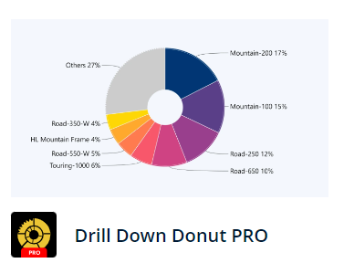
Generate powerful insights and explore category-based data using interactive drill-down and auto-grouping features.
- Adjustable “Others” and “Previous” slice
- Fully customize every slice, label, and legend
- Explore up to 9 data levels
- Multiple chart types (Pie/Donut/Gauge)
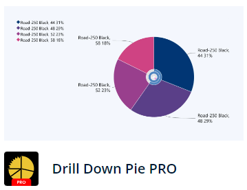
Take traditional pie chart to a new level with touch driven interactions, adjustable slices and rich customization options.
- Adjustable “Others” and “Previous” slice
- Fully customize every slice, label, and legend
- Explore up to 9 data levels
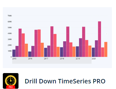
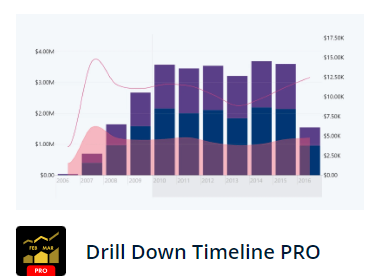
Perform a multi-level analysis of your data and explore your timeline in a simple and comprehensive way.
- Static and dynamic thresholds
- Multiple chart types (Column/Line/Area) with stacking and clustering capabilities
- Automated data aggregation on multiple time charts
- Easy time-period selection on X-Axis
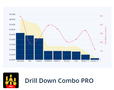
Create an impressive visualization of your category-based data end explore it using interactive drill-down and scrolling features.
- Multiple chart types (Column/Line/Area)
- Rich customization options
- Static and dynamic thresholds
- Stacking and clustering capabilities
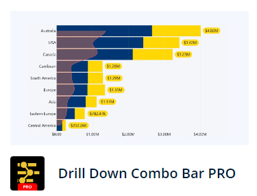
Build stunning charts by combining bars, lines, and areas. Customize each series individually with powerful customization options.
- Multiple chart types (Column/Line/Area)
- Rich customization options
- Static and dynamic thresholds
- Stacking and clustering capabilities
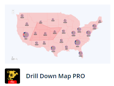
Visualize location data on maps that are easy and intuitive to explore on any device. Combine map with donut charts, use powerful custom filters.
- Node clustering, clusters can be turned into pie charts that show categories
- Supports up to 10 different shape layers (built-in, GeoJSON, KML)
- Multiple filtering options (nodes, clusters, shapes)
- Image support for nodes
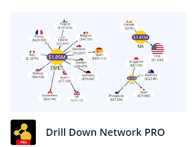
Reveal the underlying connections and explore complex tabular data with ease.
- Force feedback layout
- Category based customization
- Legend support, show up to 9 data categories
- Link decorations
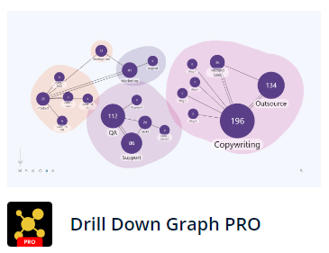
First true graph structured data supporting visual for Power BI. Immediately identify the main facets and see interconnections.
- Automated graph construction
- Visualize relations using bi-directional links
- Force feedback layout
- Group nodes with auras
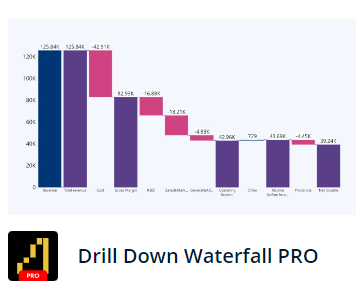
Control the way subtractions or additions to the total value are displayed with rich customization options and interactive drilldowns.
- Sub-totals let you set display values in dataset or let the visual calculate them automatically
- Create a custom sequence for the series
- Support for dynamic thresholds (avg, median, percentiles)
- Customize increasing, decreasing, and totals series separately
Visualize location data on maps that are easy and intuitive to explore on any device. Combine map with donut charts, use powerful custom filters.
- Support for DAX calculated measures
- Create a custom sequence for the series
- Support for dynamic thresholds (avg, median, percentiles)
- Customize increasing, decreasing, and totals series separately
JavaScript Charts for software development
Discover new horizons in data visualization.
Exploration and navigation with our extensive API that seamlessly integrates visualizations into your product.
Add ZoomCharts Drill Down custom visuals to your Power BI reports to make data navigation easy, fast, and exciting.
Drill Down custom visuals will let you tell an engaging data story that keeps end users hooked until the last moment.
How it works
Create complex and interactive data visualizations with minimal input.
Development time by using a ready-to-go javascript charts library.
Choose your data source
Use preloaded data or integrate with any SQL/NoSQL databases.
Select your chart type
Choose from hundreds of JavaScript chart types and customize them as desired.
Get the code
Add ZoomCharts JavaScript charts library to your web project and integrate the interactive charts with a few lines of JavaScript code.
Immersive interaction
Charts are deeply interactive – use gestures and clicks to explore data through the charts using drill-down and filtration – wow-factor guaranteed.
Content drill-down and drill-up
Dive deep into specific data point or get a bigger picture. Travel through different data levels by physically interacting with the charts by zooming in or zooming out.
Data filtering
Select one or several data points to view specific data.
Click on one point to view one data set, or shift+click to select multiple at a time.
Cross-chart connectivity
Display multiple charts based on one data set. All connected charts respond to data filtration made in any one of them, and therefore constantly reflect filtered data in each chart.
Use multiple gestures to navigate
Use gestures on touch screen devices or your mouse to navigate – pinch to zoom, drag your finger or mouse to expand the timeline, tap or click to view one data point, and more.
Handles big data
ZoomCharts is built to work with and visualize large amounts of data. Stored elsewhere, the necessary data is pulled up as it’s requested by the viewer, based on their navigation.

